Design Tips for Non-Designers
I'm not a designer, so how do I create great looking samples with the laser?
Depending on the engraving services you provide and how you operate your business, you may be required to produce different designs, either for your own sample purposes or when completing jobs for customers. This can make even the best engravers a little nervous – especially those who don’t necessarily consider themselves graphic designers. Though many of your customers will have artwork already created, if you’re making your own line of gifts to sell or producing something unique for a client, it’s important to know some basic design techniques that will help you create visually appealing designs for a variety of projects.
Prioritizing the Content: The 5 Ws and Design Hierarchy
The first thing you need to establish before you start designing anything are the 5 Ws. They are the Who, What, Where, When, and Why of your design. Establishing the 5 Ws will give your design good direction from the start and help make decisions along the way easier. Creating a design for an award is unique because there are two "who's" to include in the design - who will be receiving the award, and who is presenting the award. Which of the two who's to emphasize more is up to you, but in most cases the organization giving the award away is higher in the design hierarchy of the overall piece.
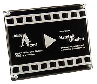
When designing an award, memorial or plaque, the design hierarchy becomes a very important tool used in leading the viewer through your design. Emphasizing certain details more than others and creating hierarchy in your design is achieved by utilizing design concepts like size, white space, contrast, and balance. In this example, the imagery along the bottom immediately pulls you in to find out more. Then the white space in the top two thirds of the award pulls your eye up to see who is presenting the award. Naturally from there, the viewer will read down through the middle of the award, which displays the when, what, why and second who, the recipient of the award.
The design hierarchy of the who, what, where, when and why information on this award is clearly established in this design. The awards simplicity and good use of white space makes it easy to read.

Typeface Selection
When engraving projects, such as an award, plaque or custom business card, it is important to limit your design to two or (no more than) three typefaces. It is always safe to use the "golden rule" of typeface selection by choosing complementary typefaces - one san serif, and one serif. Choosing an abundance of different fonts will make your project look crowded, busy and hard to read. It is also important for designers using laser engravers to consider the material type before selecting typefaces as well. A wispy typeface, with thin lines, might not engrave well on the softer woods.
Just as a general rule, select typefaces that are different enough from one another so that they can be easily distinguished, but make sure they’re not so different as to look silly or unprofessional.
For example, if you pick a typeface that is very unusual and has a lot of character and detail, use it sparingly. If you go for a very bold and unusual selection, pair it with something more basic and less busy.
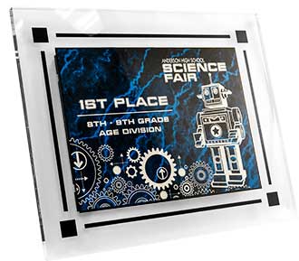
This award includes two bold and futuristic typefaces that both compliment the science fair theme very well.

Clean layout
Though many people fall into this trap, there’s no need to center every single word or graphic on an award or other personalized engraving. Centering some elements in a design can help with the hierarchal flow and draw the reader's eye in the right direction. Right or left justifying some of the text and images in other areas can help give a design good contrast and balance.
Lining up elements in a design either vertically or horizontally can help give the final engraving a more polished and sophisticated appeal.
This award features the use of graphic imagery that quickly tells the viewer what the award is for, without having to read any text. The single type treatment then makes it easy to see who is giving the award away, and who is receiving the award.

By keeping in mind these three simple rules whenever you engrave - the 5 W's, typeface selection, and clean layout - you can upgrade your design skills and present the most professional looking designs possible. Your customers will be asking you where you found your graphic designer in no time!
If further assistance is required, please visit www.epiloglaser.com/support to contact Epilog Laser Technical Support.